Merrill Edge
Options Screener
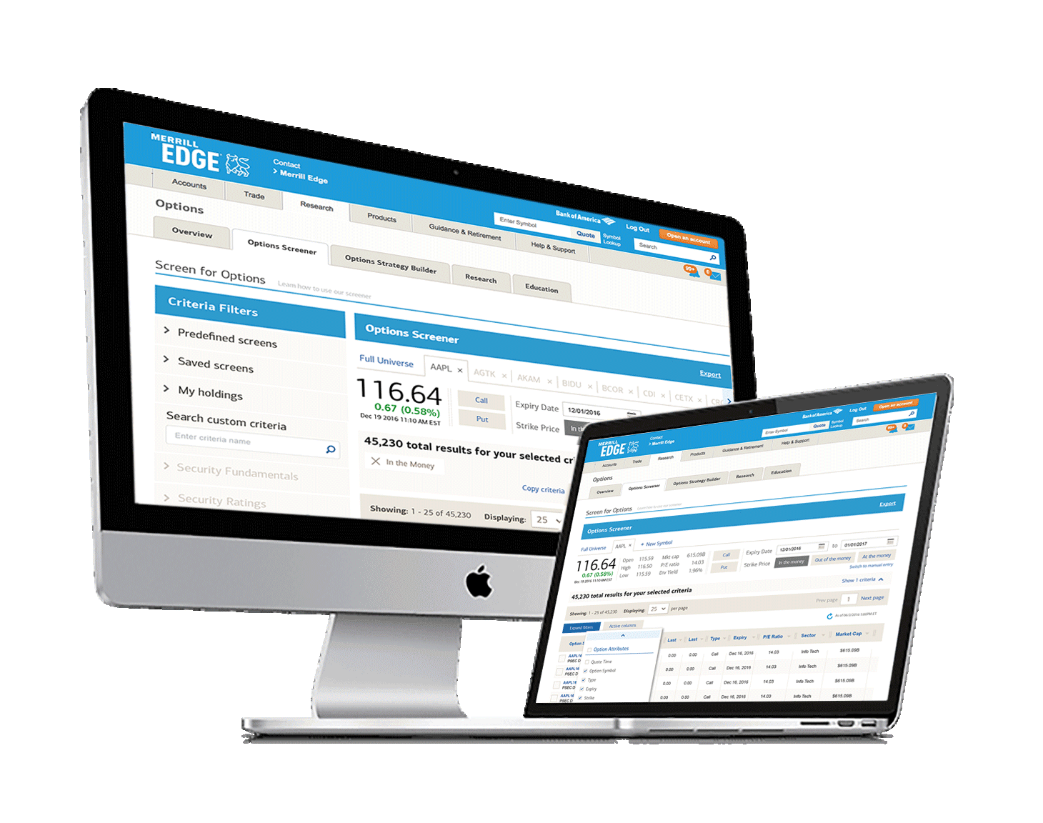
Merrill had a request to design a desktop option screener. After several meetings with stakeholders, we could document the business requirements and begin to wireframe ideas. The wireframes were presented to the client bi-weekly to get their buy-in, and any comments or concerns were approached while designing the wireframes. Once the wireframes were signed off by the client, we began to design the polished version. With this specific project, we had access to a front-end developer who could build the prototype for user testing.


A Merrill Edge researcher did the user testing part of this project. We were, however, able to give usability test plans for scenario-based testing. We were also able to listen in on the testing as it happened. They were able to gather ten users, but we only ended up with eight results because of no-shows.
Below is a sample of the components designed for the user to narrow the results of the options. We were able to add the components as part of the user testing to establish whether each one was easy to use and understand.
